FEMMESFERA
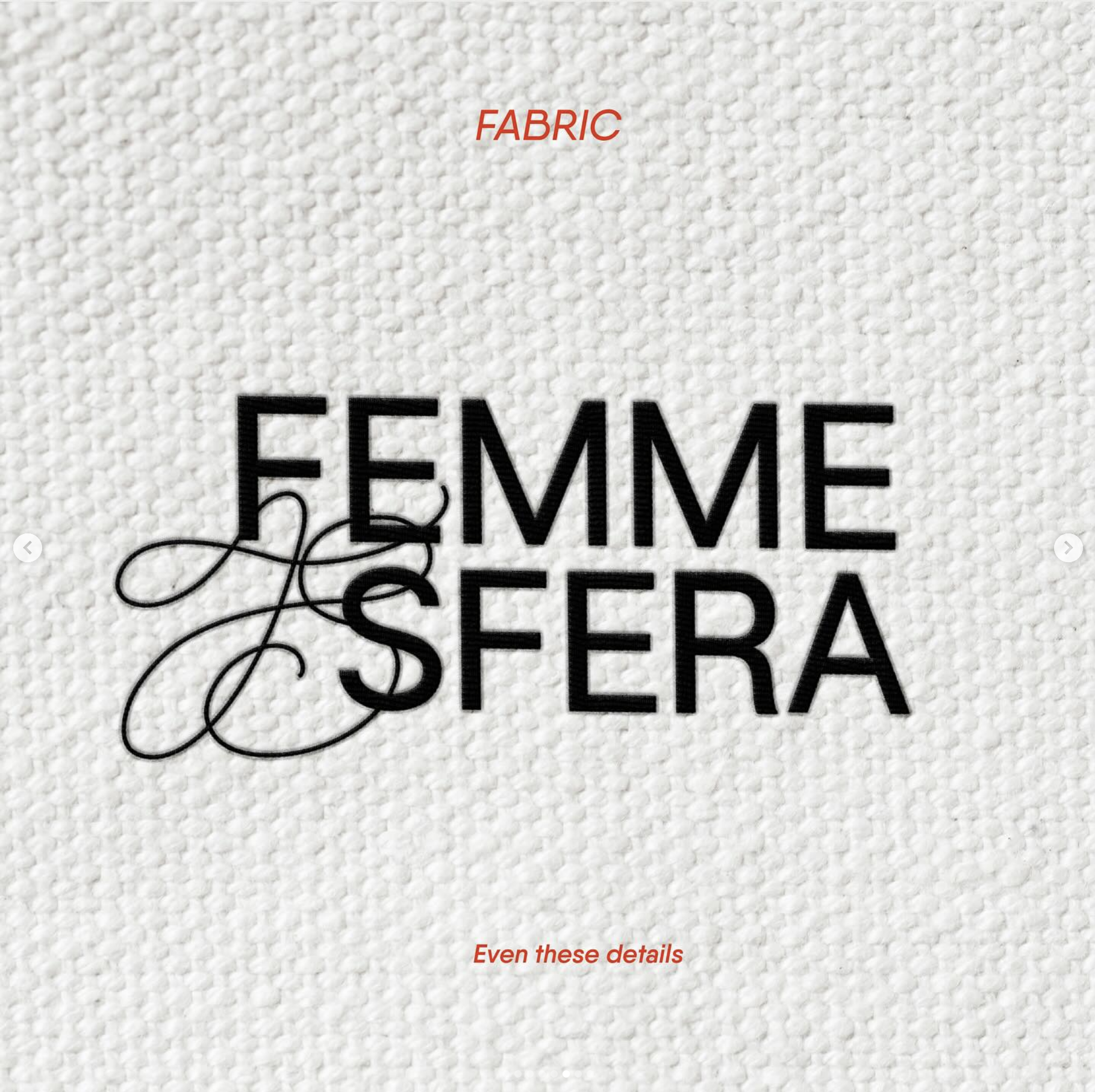
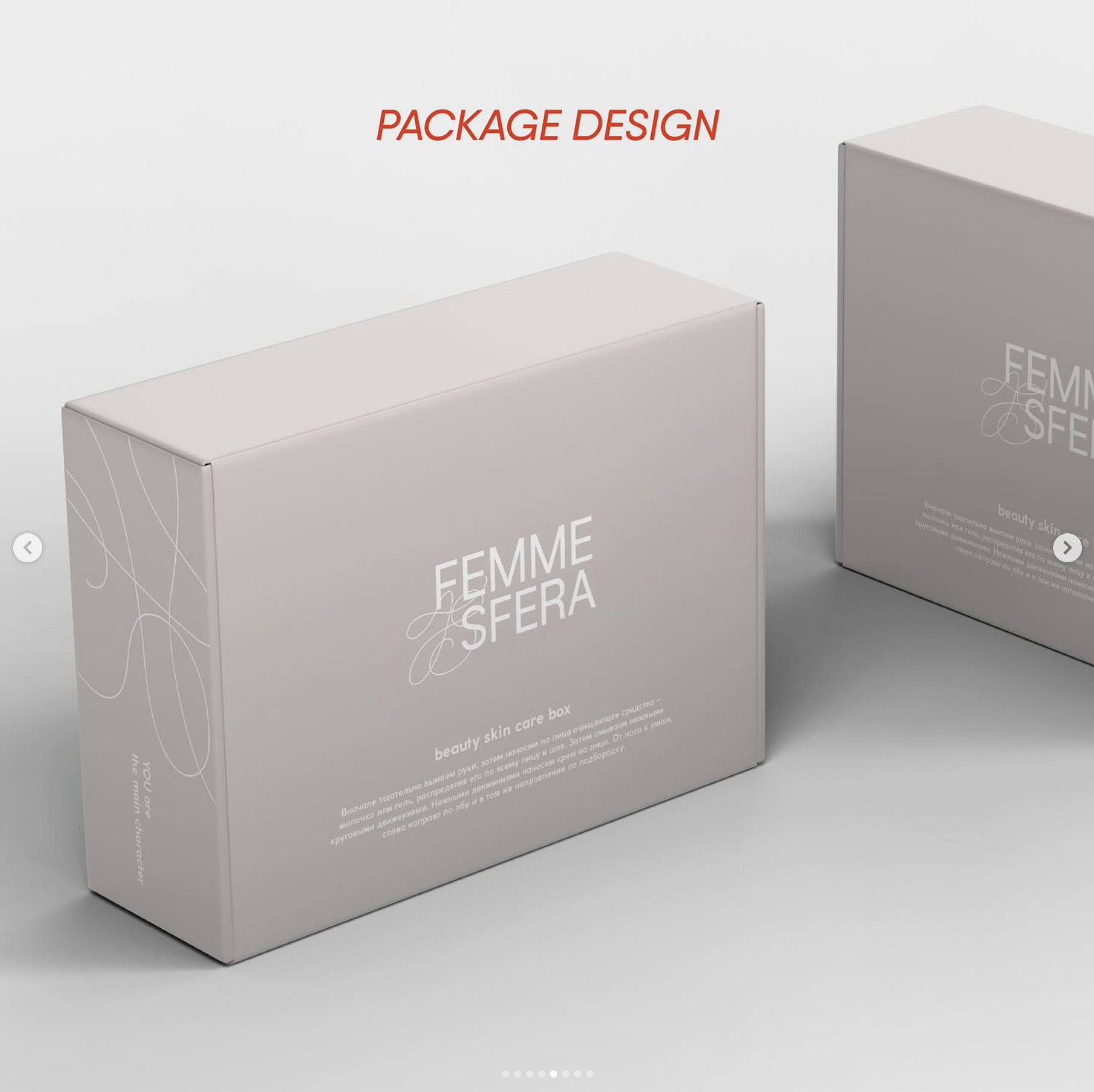
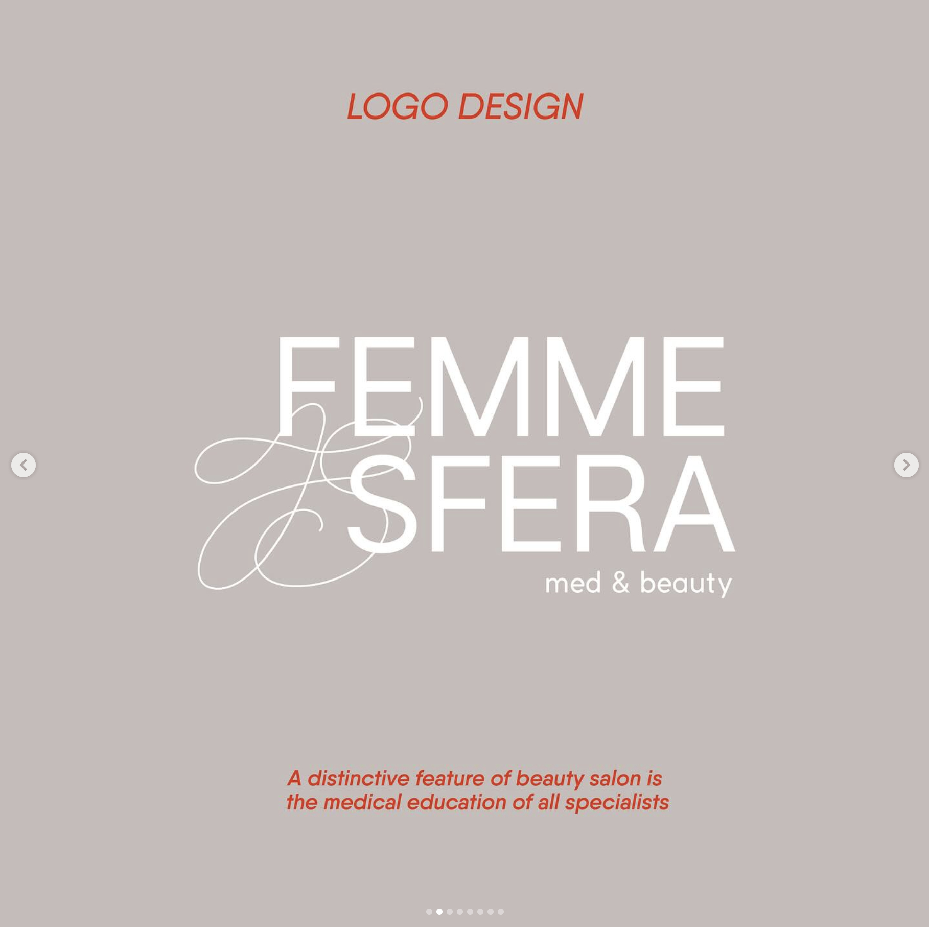
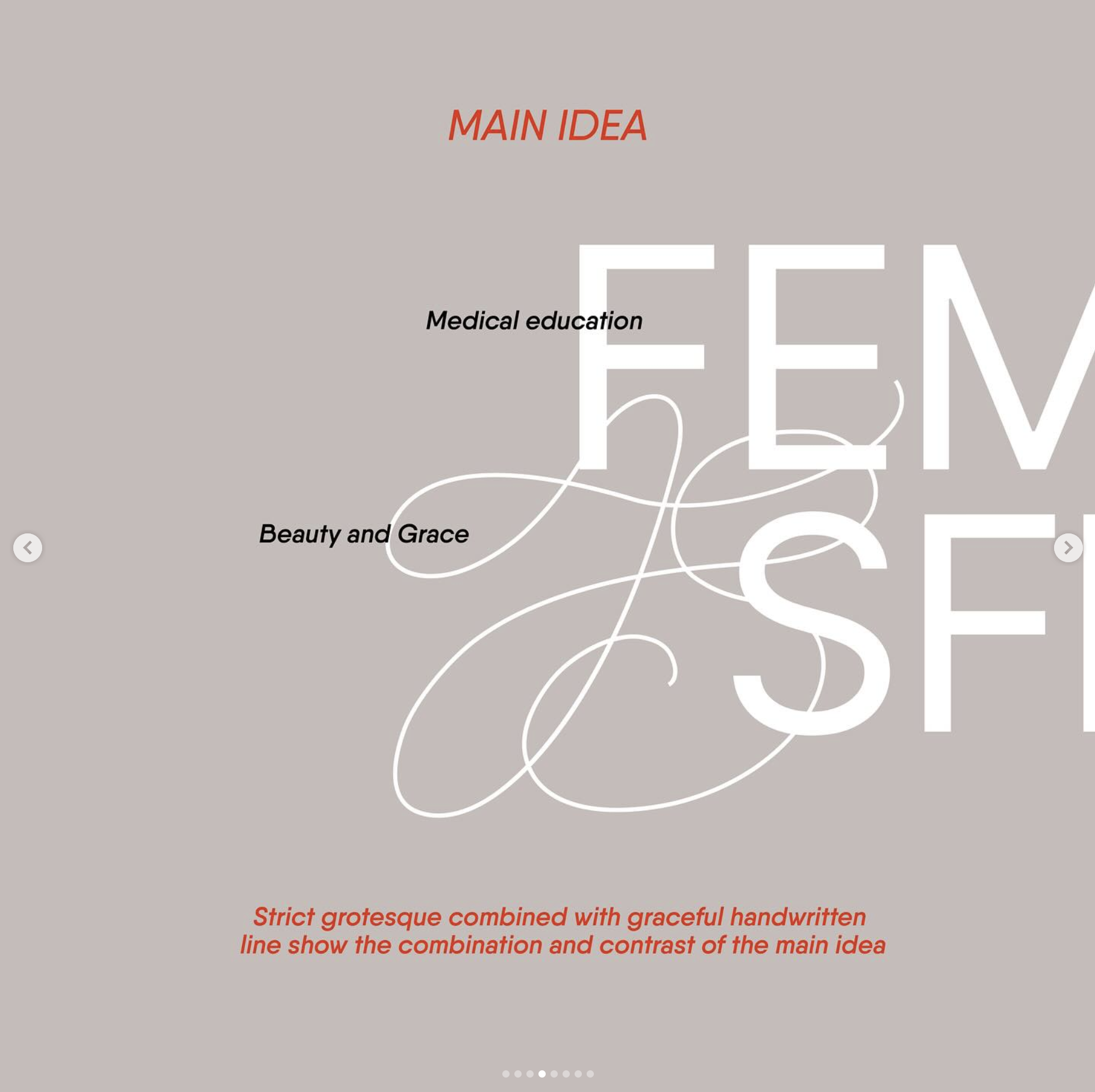
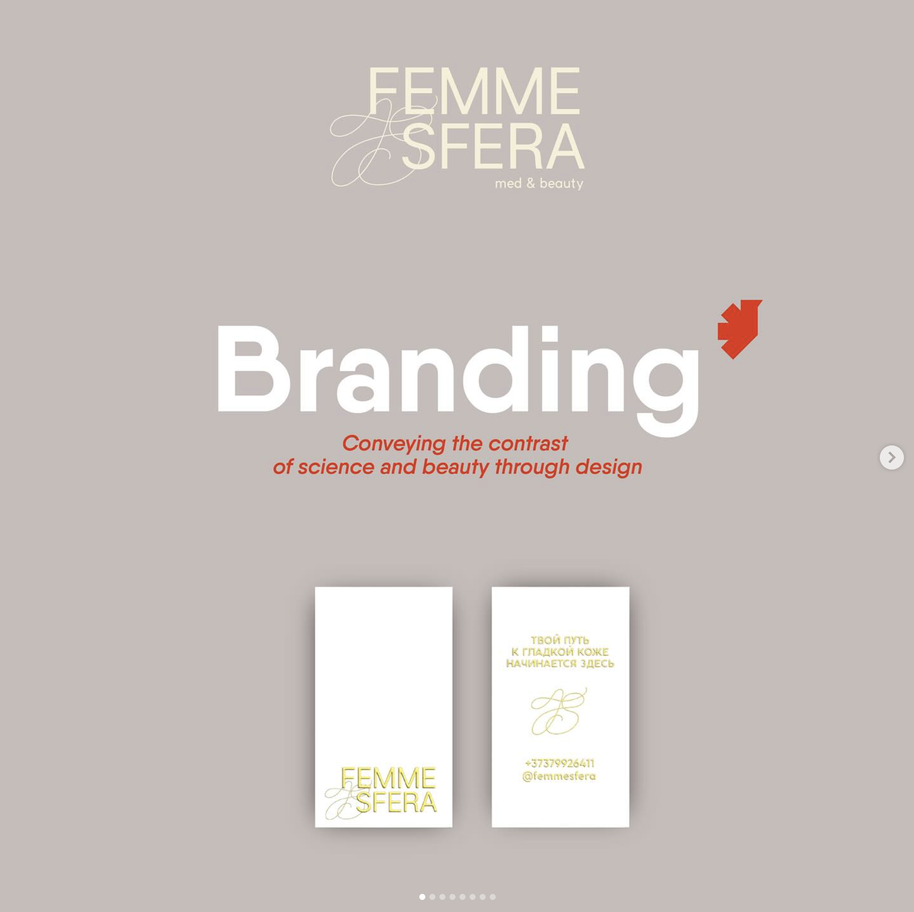
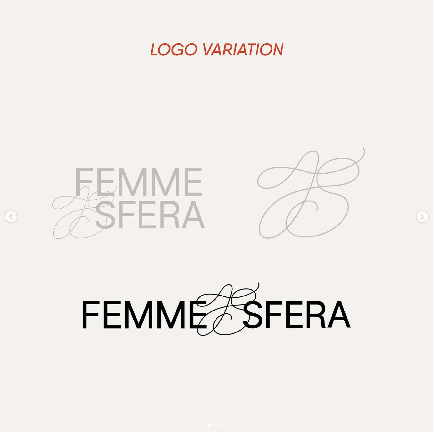
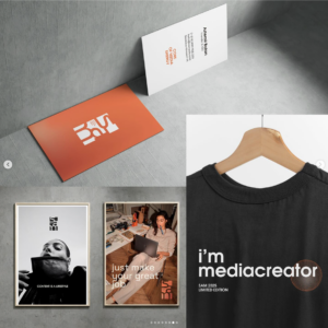
The branding, including the name and logo, for “FEMMESFERA,” reflects the unique essence of the brand. The logo is a typographic solution that combines strict, direct fonts with smooth, delicate feminine lines, symbolizing the harmony between medical professionalism and beauty industry services. An important task was to highlight the value of the salon’s staff, all of whom hold medical degrees, adding an extra layer of trust and reliability. The design focuses on elegance and sophistication, aiming to attract women and instill confidence in the quality of the services provided.



Reviews
There are no reviews yet.